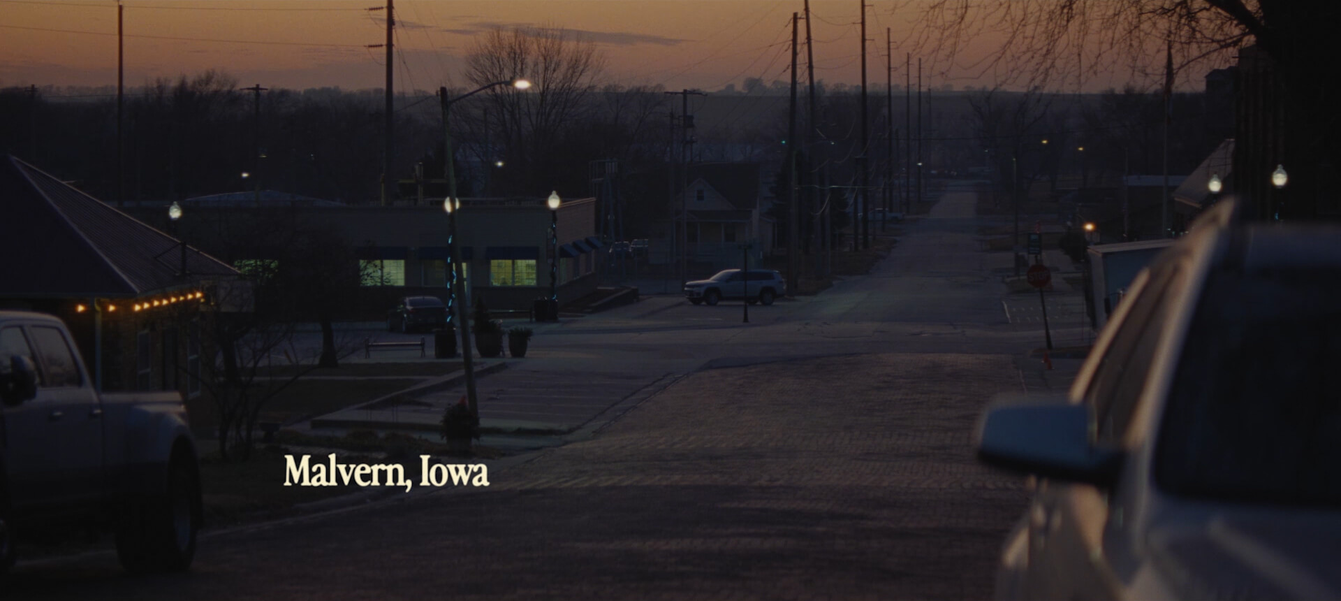
The opening of the film. The full documentary can be seen here.
The end credits
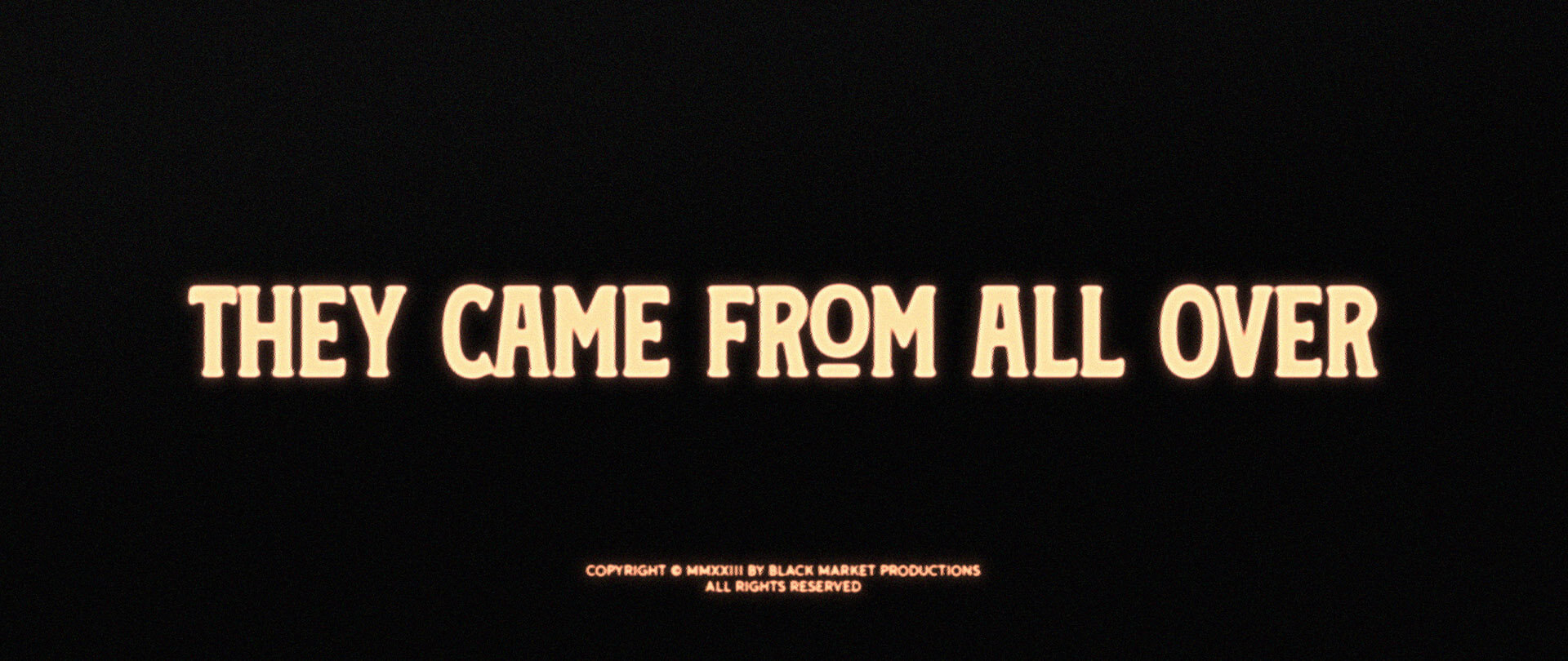
Rayka envisioned the film's typography to have a sense of nostalgia and small town charm, to represent the place and setting of the film. This first concept was inspired by old-school signs and labels. It combined a bold type, derived from vintage signage with a handwritten script.
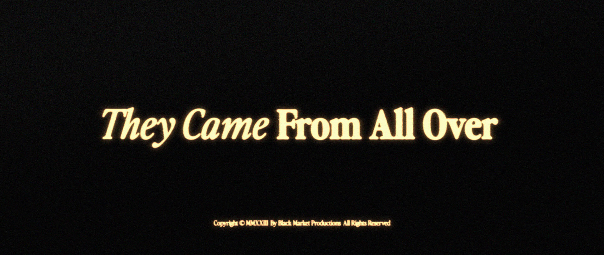
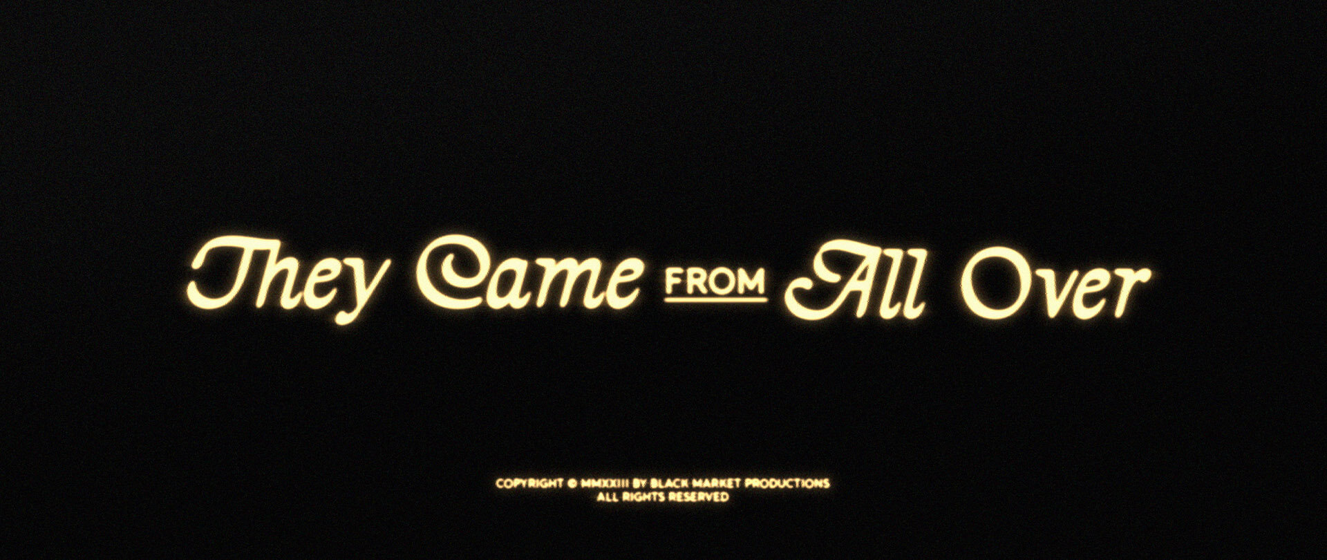
The second concept, which we ultimately went with, paired an italic and bold weight of the same font family to create an interesting clash. The chosen font family has a subtle retro vibe, yet still feels modern and elegant.
The third concept brought a bigger juxtaposition between typefaces – one ornate vintage script font, with a modern serif font. Pairing the ornate with something more simple created a nice balance of elements, which helped made sure the overall design didn't skew too old-fashioned.